Timeline Widget
This widget enables the dashboard designer to quickly figure out if the expected changes are occurring, what time lag would exist across different devices (X axis value is defined by the tango attribute timestamp field), if a state is ever reached, how long a device would remain in a state.
The order on the y-axis in each swimlane can be that induced by the “natural” ordering of the range of the attribute/state (eg. the order of the enum provided by Tango)
A shared swimlane can be used for attributes A1,A2, … only if the set of values of the attributes is the same in no way attributes A1, A2 are placed in the same swimlane if their sets of values differs
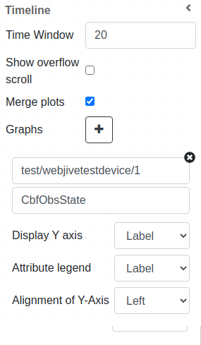
Widget settings
The dashboard designer has the ability to customize these elements:
Time Window
Show overflow scroll
Group attributes
Graph to add swimlanes
Select device & attribute
Display Y axis
Attribute legend
Alignment of Y-axis(Left / Right)
Attribute selection
Taking as an example the SKA webjivetestdevice we can see here all the DevEnum + DevState attributes present to selection:
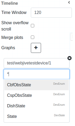
Note
At the moment given widget supports only enum-typed and DevState attributes (like obsState and State for SKA devices).
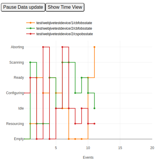
Widget look and feel
The following pictures show how the widget looks like in a running dashboard.
User can add swimlanes by clicking + button in the widget inspector/settings.
This are some of the types of widget display the user can have:
Three DevEnum attributes displaying in event view not grouped:
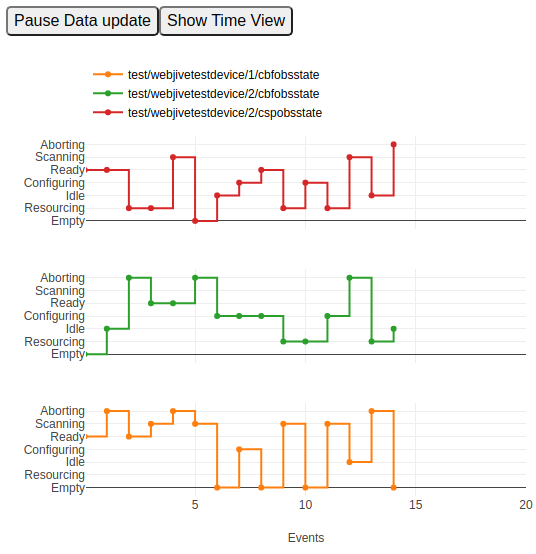
Three DevEnum attributes displaying in event view grouped:
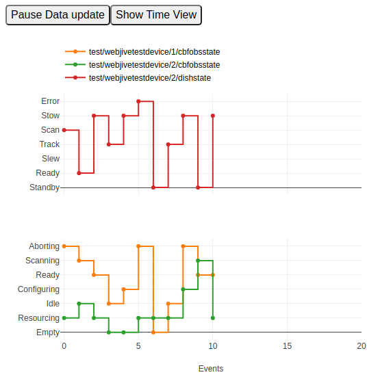
Three DevEnum attributes displaying in time view grouped:
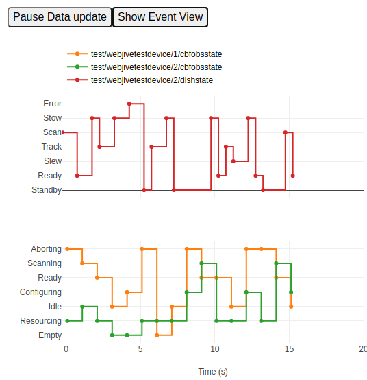
Three DevEnum attributes displaying in even view grouped
In this case attribute dishstate has different labels so the widget decides which ones can be displayed together:
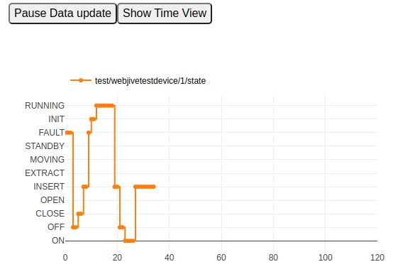
Example of State attribute:
Set of default plotly tools are displayed on top of widget click picture, zoom, pan etc.
