Attribute Heat Map
A heat map (or heatmap) is a data visualization technique that shows magnitude of a phenomenon as color in two dimensions. The variation in color may be by hue or intensity, giving obvious visual cues to the reader about how the phenomenon is clustered or varies over space.
The widget shows a heat map coming from an attribute. It does not accept scalar or spectrum attributes, but only two-dimensional attributes.
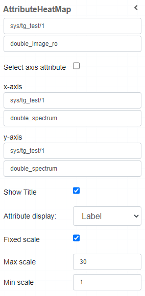
Widget setting
The user has the ability to:
Select the device and the two-dimensional attribute
Select x and y axis, as well as their two-dimensional attribute
Show title: show the title on top of the heat map. The title is the attribute name
Attribute Display: select if show the name or the label of the device in the title, or none. Label is shown as default
Fixed scale: if selected, it uses a fixed scale. It is selected as default setting.
Max scale: represent the number of the max scale. By default it is set to 30
Min scale: represent the number of the min scale. As default is setted as 1
Widget design
Once plotted, the result is like the following image:
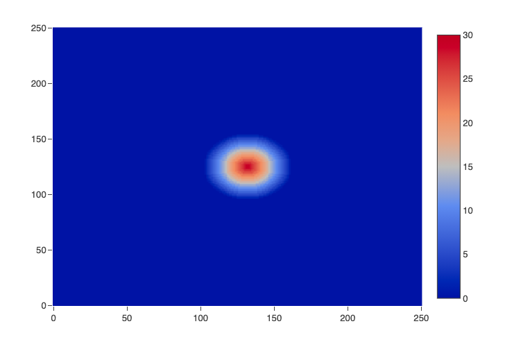
Notice: the map legend is shown on the right *