Device Status
The widget shows state(ON, OFF, RUNNING etc.) of a device.
In particular, the widget displays a led with a target color respresenting the state of device.
Widget setting
The following image shows an example of a widget setting.
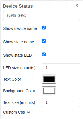
The widget takes the actual value of the state of selected device. In the example widget will show the STATE of sys/tg_test/1 device.
It is possible to customize the widget setting from the inspector panel(in edit mode), as below:
Input value |
Description |
|---|---|
Show device name |
Show device name on UI. It could be: “checked” or “unchecked” |
Show state name |
Show state of device in |
Show state LED |
Show LED on UI respresenting state of device. see Color mapping of LED |
LED size |
Specify the size of LED on UI |
Text size |
Specify the font size of text for given widget |
Link to |
Provide the URL. In run mode the label text is displayed as a hyperlink, that opens up the target in a new browser tab if clicked. |
Color mapping of LED
Color |
State |
|---|---|
Green |
ON, OPEN, EXTRACT |
Dark Green |
RUNNING |
White |
OFF, CLOSE, INSERT |
Light Blue |
MOVING |
Yellow |
STANDBY |
Red |
FAULT |
Beige |
INIT |
Orange |
Alarm |
Magenta |
DISABLE |
Grey |
Unkown |
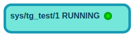
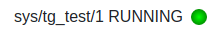
In the example below shows device status of RUNNING device.
Applying CSS to widget
One can also write css under custom css section. The css syntax is same as we write for html files
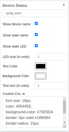
The CSS rules written in custom css section are applied to the widget as below: