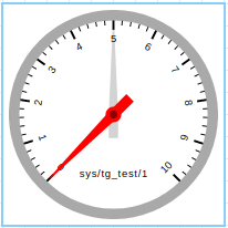
Attribute Dial Widget
A widget that shows the value of an attribute using an animated dial
Widget setting
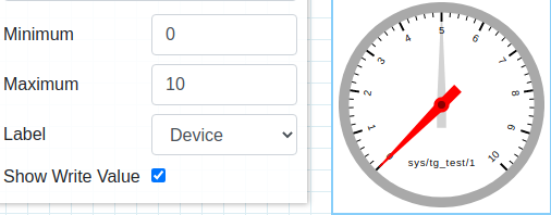
When using the widget the user has a couple of options to configure it:
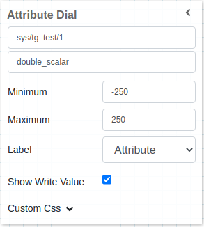
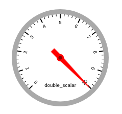
First, it should select the attribute to use, it accepts all types of scalar attributes.
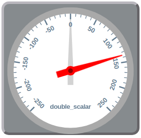
It also has a minimum and maximum configuration, that will limit the widget display, for example, if the attribute has a value of 25 and the widget is configured for a maximum of 20, everything above 20 will be displayed as 20.
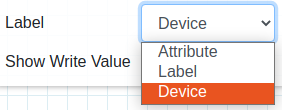
The user can also select 3 types of labels to display on the widget, Attribute, Label and Device
Finally, the user can select either to display the write value or not, if selected a grey knob will appear together with the red knob from the actual value
Widget design
Applying CSS to widget
One can also write css under custom css section. The css syntax is same as we write for html files
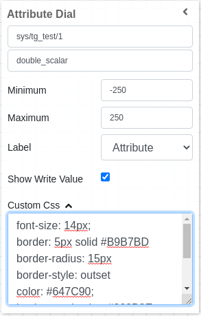
The CSS rules written in custom css section are applied to the widget as below: