Attribute Plot Widget
A widget that plots the value of one or serveral device attribute over time.
Widget setting
The plotting of the attributes is based on a time window, which denotes the size of the time interval (in seconds) the x-axis of the plot covers. At any given time, the widget plots each included attribute over the n last seconds, where n is the size of the time window.
There are also two boolean settings for specifying if a zero line should be drawn in the graph, and if the y-axis should be logarithmic.
Finally, the widget settings are used to define which attributes to plot. By pressing the plus sign, a new plot is added to the widget.
For each plot, an attribute has to be defined. This is done with an attribute selector, where you first have to specify a device, and then one of the available attributes of this device. Note that you can get a complete list of either by typing an asterisk into the text field. Lastly, there is an option for where to display the y-axis values, which default to the left side of the widget.
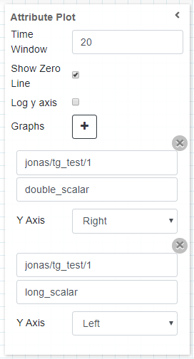
The settings of an attribute plot widget plottning two attribute of the same device. The widget is using a 20 second time window.
Widget design
Taranta is using the Plotly framwork to render the plots. Each plot is automatically assigned a unique color, and the range of the y-axis self-adjusts to fit all data points for every plot being displayed. By hovering over the widget in run mode, additional options are made available from a toolbar, such as zooming and panning. These come from the plotly framwork itself, but the functionality of two of them have been overwritten to better suit Taranta. By clicking autoscale, the time-window mode is disabled, and the y-axis instead covers all data points it has registered so far. To go back to the windowed mode, click on Reset axis.
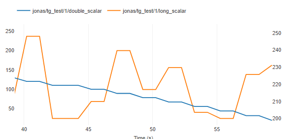
The same plot in run mode, showing all the data points recieved in the last 20 seconds for both of the attributes.