SVG Component Custom CSS Integration
With the new custom CSS feature, users can now apply styles to SVG components based on Tango device states and attributes. This allows for dynamic and visually distinct representations of device data. There are two ways to apply CSS to SVG Below is a guide on how to utilize this feature effectively.
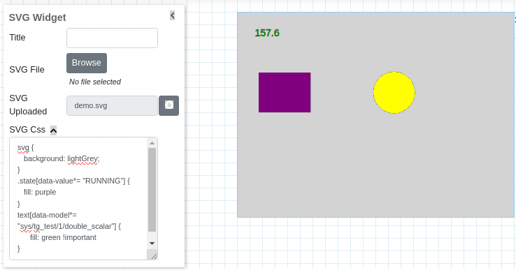
Note: Custom CSS feature is available only for the SVG widget.
A. Custom CSS Model
Applying Custom CSS to a Device and Attribute
To apply custom CSS rules to a specific device and attribute, use the following format in your CSS file:
svg .state[data-model="<value>"] {
    /* Your CSS rules here */
}
Example:
To change the fill color of a component based on the model(model is defined in SVG component object properties):
svg text[data-model*="sys/tg_test/1/double_scalar"] {
    fill: green !important;
}
Note: use important to override existing CSS
Applying Custom CSS to General Values
You can also apply custom CSS rules to all models that have a specific value. This is useful when you want to style all components that have a common state or attribute value.
svg [data-value*="<value>"] {
    /* Your CSS rules here */
}
Example:
To change the fill color of all components that have a value of “ON”:
svg [data-value="ON"] {
    fill: green;
}
B. Using Inkscape to Assign Custom CSS Classes
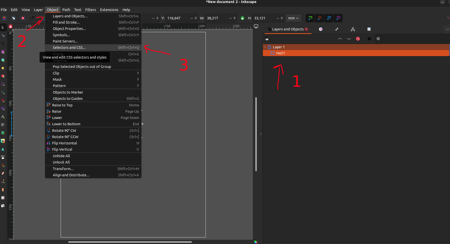
You can assign custom CSS classes to SVG components using Inkscape, a popular SVG editor. Add CSS class to SVG component using Inkscape and then use the same class in SVG Widget > SVG CSS to define your custom CSS This allows you to apply styles to specific elements within your SVG based on custom class names.
Steps:
Open your SVG file in Inkscape.
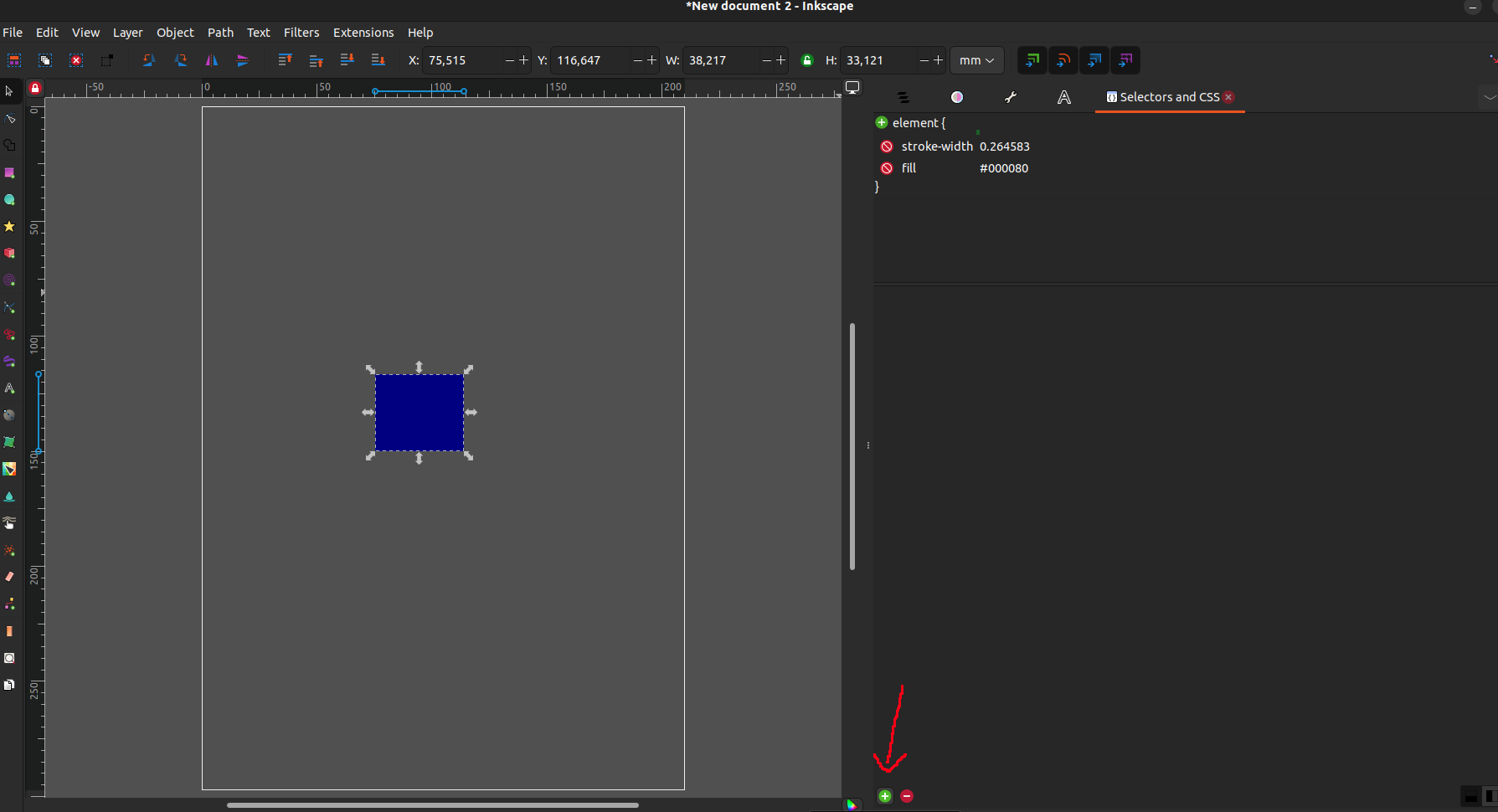
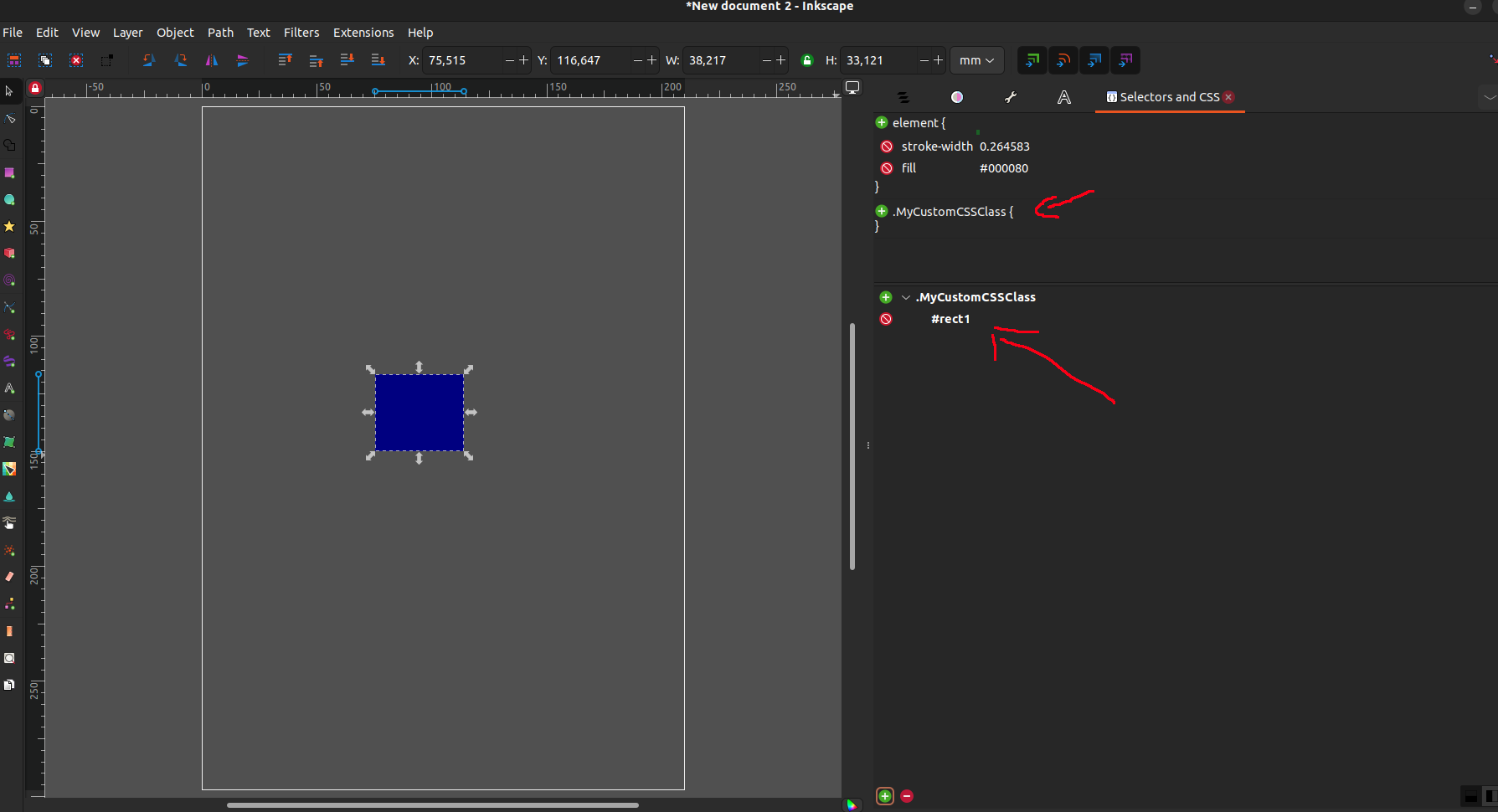
Select the component you want to add a custom class to, then open Object -> Selectors and CSS (or Shift+Ctrl+Q).
On the right, a new tab will appear where you can add new custom classes. Press the + on the top left corner.
A new pop-up will appear. Insert the name of your new class, in this case `.MyCustomCSSClass` (make sure you have the `.` to indicate it’s a class).
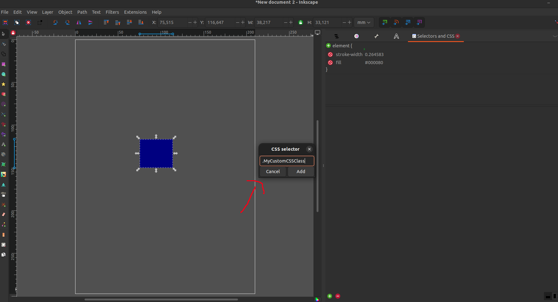
Press Add, and you will have a new class in your SVG. This class will now be applied to the selected element, in this case `rect1`.
Now, you can apply custom CSS rules to elements with this class:
svg .MyCustomCSSClass {
    /* Your CSS rules here */
}
Example Custom CSS
Below are two examples of custom CSS that you can use as a starting point for your SVG components.
Example 1: Device State Colors
This example changes the fill color of components based on the state of the device:
svg .state[data-value="ON"] {
    fill: green;
}

svg .state[data-value="OFF"] {
    fill: red;
}

svg .state[data-value="ALARM"] {
    fill: yellow;
}

svg .[data-value*="HIGH"] {
    fill: green;
}
Example 2: Custom Classes and Device Attributes
This example uses custom classes assigned in Inkscape and changes styles based on device attributes:
svg .MyCustomCSSClass {
    stroke: blue;
    stroke-width: 2px;
}