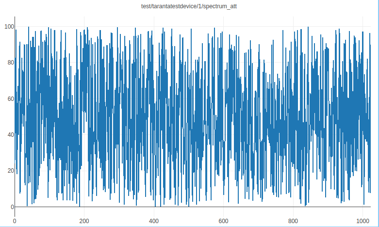
Spectrum Widget
A widget that allows plotting spectrum data using Plotly, providing a configurable visualization of a spectrum attribute.
The widget shows a spectrum plot based on selected indices from the spectrum attribute, with options to configure both X and Y axes independently.
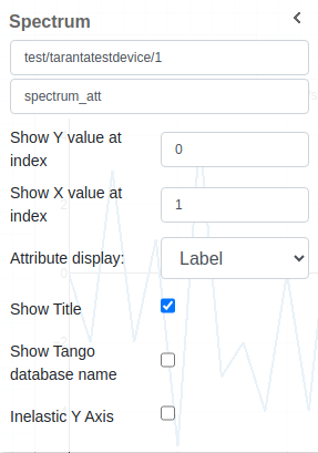
Widget Settings
The user has the ability to:
Select the Device and Spectrum Attribute: Choose the specific device and its corresponding spectrum attribute to visualize in the plot.
Show Y value at index: Configure which index of the spectrum data to use for the Y-axis. Leave empty to use the normal index increment.
Show X value at index: Configure which index of the spectrum data to use for the X-axis, independently of the Y-axis. Leave empty to default to normal index values.
Attribute Display: Choose how the attribute is displayed in the title—either by its name or its label. The label is shown by default.
Show Title: Display the title of the plot, which can include the device and attribute information.
Show Tango Database Name: Toggle the display of the Tango database name alongside the device information in the plot title.
Inelastic Y Axis: Adjust the Y-axis to be inelastic, modifying its range to avoid tight bounds on the data points.