Box Widget
This widget enables users of Taranta in defining complex dashboards, allows a way to group and ungroup widgets. A group can be placed, dragged, resized as a single item in the canvas and can be moved up/down the layers as if it were a single widget.
Note
Box widget works with one layer of nesting i.e. A box widget can be nested inside another box. In a nutshell box A cannot have a box B containing another box C.
Widget setting
The user has the hability to select:
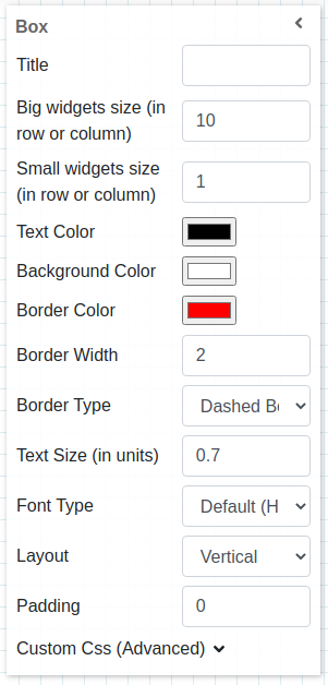
A free label for the widget (string), shown on top (leave blank to hide)
Big widgets size (in row or column), defines the minimum size for graph widgets
Small widgets size (in row or column), defines the minimum size for non graph widgets
Text Color (color palette) to set the color of text in widget (default set to black)
Background color (color palette) to set the background color of the widget (default set to white)
Background color (color palette) to set the border color of widget
Background Width to set the width of the widget
Background Type (dropdown menu) to set the border style of widget (default set to no-border)
Text size (integer) set the size (in em) of text in widget
Font Type (dropdown menu) set the font family of text in widget
Layout (dropdow) set how other widgets would be placed in box widget
Padding set padding around widget
Custom CSS allows user to set custom css to widget
Widget input
User can group different widgets by drag and drop widgets into the box widgets. User can drag and drop widget either from widgets section or an existing widget on the dashboard. It is also possible to move the widgets from different box widgets in the canvas.
Widgets dropped on box widgets aligned as per the layout defined by the user. Layouts can be as below
Vertical: One widget is rendered on one row, the next widget rendered on the next row.
Horizontal: All the widgets are rendered in one row, side by side.
widgets order
Widgets contained in a box widget follow the order defined by the user. It is possible to drag and drop a widget on the left (in case of horizontal layout) or above the stack of widgets (in case of vertical layout), on right or bottom, or in the middle and the order will be maintained. It is also possible to drag and drop a widget contained in a box widget to reorder it.
Widget handler
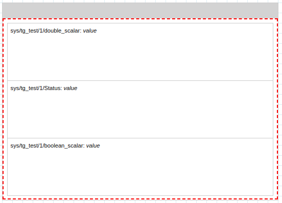
In order to help users to select and move the box widget, a handler has been created, this is positioned on the top of the widget while in edit mode, defined by a grey rectangle that fits the width and has 30px height. It accepts select actions as well as drag ones. This handler disappears once the user starts the running mode.
Box Widget configured on Edit Mode:
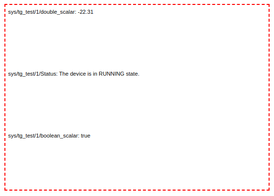
Box Widget configured on Run Mode:
Sizing Inner Widget
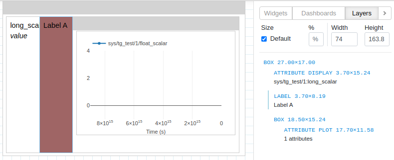
User can change the size of widgets on dashboard directly from canvas. For changing the size of inner widgets contained in a box user can use size section in layers tab.
User can select inner widgets to size either from canvas or from layers tab
The selected widget has light blue border on its left in Layers Tab. The size section under Layers tab is enabled on selection of inner widgets.
Inner widgets are widgets contained inside a Box Widget. An inner widget can be normal widget or even an Box Widget
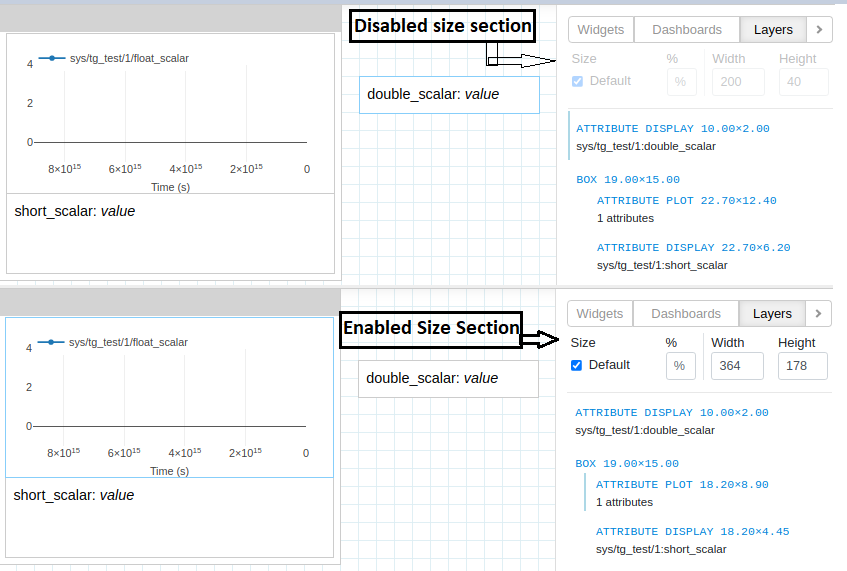
After selecting box inner widget, user can change size of it’s using either the percentage field or via width & height fields.
Percentage applies to widget height for box widget with vertical alignment and same applies to width for box widget with horizontal alignment
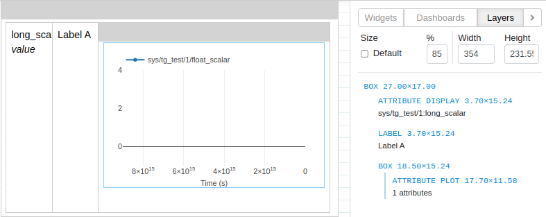
Alternatively user can also use width & height inputs to give widgets custom size in pixels
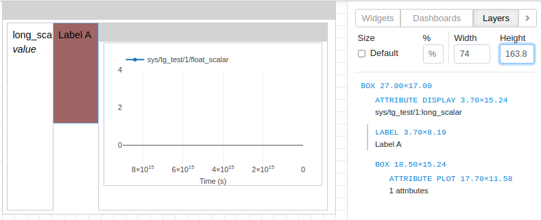
The default layout of Box Widget is overridden when user changes the size of inner widgets using percentage or width & height.
Using default checkbox under size user can revert to default layout of box widget.