SKA Octopus Frontend User Guide
This guide walks through the main user-facing areas of the SKA Octopus dashboard. It focuses on the controls you use every day, how changes are saved to your profile, and the features you can use to tailor the workspace for operations.
User Interface
The interface is split into three persistent regions:
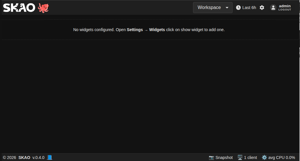
Header (top bar): Shows the SKAO and Octopus logos, the active workspace selector, the global time range indicator, the settings gear, and the sign-in/out button. Clicking the Octopus mascot temporarily makes every widget visible in the current workspace.
Workspace canvas (centre): Hosts the grid of widgets for the active workspace. When layout editing is enabled (see the Widgets tab), widgets can be dragged, resized, duplicated, or removed. Workspaces can optionally be split into panels that group widgets under titled sections; if you have not defined any panels the canvas behaves exactly as before, showing every visible widget in a single block.
Footer (bottom bar): Displays the current app version, links to the changelog, provides a direct documentation shortcut, and shows live performance indicators (clients connected and average CPU). Click the version to open the changelog portal, the 📘 icon to launch the full documentation site in a new browser tab, and the performance tiles for live metrics.
Data Freshness Indicator
The footer shows a time since last data update indicator when data freshness monitoring is enabled. The warning icon (⚠️) behaviour depends on the workspace configuration:
|
Widget supports polling |
Warning Icon (⚠️) |
Counter |
|---|---|---|---|
|
N/A |
❌ Hidden |
❌ Hidden |
Has widgets, config has |
N/A |
❌ Hidden |
✅ Shows |
Has widgets, no |
Yes (in |
✅ Shown |
✅ Shows |
Has widgets, no |
No (subscription-only) |
❌ Hidden |
✅ Shows |
Empty
widget_configs({}): No widget configuration is present, so both the warning icon and the time counter are hidden.useLiveData: truein widget config: Widget is explicitly marked as subscription-based. Warning icon hidden, counter shows.Widget in
POLLING_KEYS(supports polling): Warning icon shown when data is stale, counter shows.Widget not in
POLLING_KEYS(subscription-only): Warning icon hidden because subscription data doesn’t reset the timer, counter shows.Empty workspace (no layout widgets): Nothing is shown.
Control this via Settings > Preferences > Header clocks > Data freshness mode:
conditional(default): Shows only when data is stalealways: Always visibledisabled: Never shown
Widget Response Notices
Widget Response Notices are per-widget health indicators shown in the top-left corner of a widget instance when the latest response is incomplete or failed.
Notices are scoped to each widget instance, so one widget can fail while others continue normally.
Hover a notice to open the details card. The card lists interpreted issues, shows the raw payload (
Issues only/All), lets you download the payload as a log, and lets you hide the notice.If data is partially available, the widget can still render while the notice explains what is missing.
Notice Log Download Format
Downloaded notice logs now include:
widget_config_clipboardin direct paste format for Widget Settings paste actions.
You can copy the full widget_config_clipboard block and paste it directly where widget settings clipboard payloads are accepted:
octopus.widgetSettingsClipboard:{
  "widgetKey": "graph",
  "rate": 12,
  "cfg": {
    "title": "Telemetry",
    "series": [
      "a",
      "b"
    ]
  },
  "scope": "all",
  "copiedAt": 1773223200000
}
Notice Severity and Trigger Rules
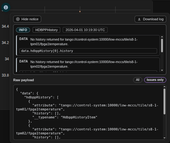
Info notice
Triggered when historical data is missing but this is not treated as a hard failure.
Typical cases:
Empty history arrays (
[]) for the selected range.Partial history coverage (some series returned data, some series did not).
Summary text can include the selected time range and a count of affected series.
Warning notice
Triggered when the response shape is valid but values are incomplete or suspicious.
Typical case:
Response fields with
value: nullwhere a usable value is expected.
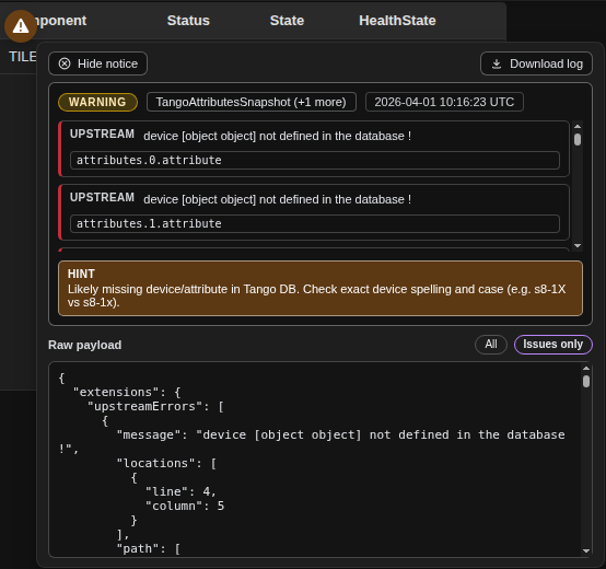
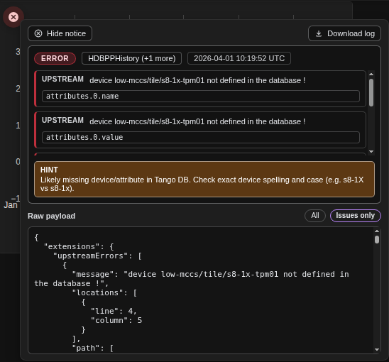
Error notice
Triggered when GraphQL returns errors or upstream processing fails.
Typical cases:
GraphQL
errors.extensions.upstreamErrors.
Screenshot Placeholders (replace with latest captures)
Warning notice screenshot:
Info notice screenshot:
Error notice screenshot:
Dismiss and Recovery Behavior
Dismissed info notices are remembered for the current page lifetime and remain hidden during auto-refresh; they return after a full page refresh.
Dismissed warning and error notices are not persisted and can reappear on the next matching response.
Expected request cancellations (for example during workspace switches or while entering layout edit mode) are treated as transient and do not raise widget error notices.
After layout edit mode is turned off, widgets remount once to retrigger previously aborted in-flight requests.
Workspace Snapshot Replay
The Snapshot feature in the footer now supports replaying a captured workspace state.
Capture snapshot: Left-click the
📷 Snapshotbutton in the footer. The app captures a full PNG and embeds replay metadata (workspace state, viewport, variables, and cache snapshot) inside the file.Open replay portal: Right-click the same
📷 Snapshotbutton to open Replay Snapshot.Apply replay: Upload a PNG created by Octopus snapshot capture, then click Apply Snapshot. This restores captured workspace state and enables replay mode.
Replay mode behavior: Live communication is paused while replay mode is active. Streams and in-flight HTTP operations are stopped so the restored state stays frozen.
Exit replay: Use Exit Replay Mode in the replay portal or the header replay exit control to resume live communication.
Edit restrictions: Layout edit mode is blocked while replay mode is active; exit replay mode first to re-enable editing.
Layout Edit Mode
Layout Edit Mode unlocks drag, resize, duplicate, and remove interactions on dashboard widgets (subject to your role permissions and workspace access mode).
You can enable it in two ways:
Keyboard shortcut: Hover the workspace canvas and press E.
Settings path: Open Settings → Widgets and toggle Enable layout editing.
Settings toggle:
Roles, Sharing, and Security Model
Editors (any non-Viewer role) can edit layouts, widgets, panels, variables, themes, and workspaces (including sharing them). Layout editing is enabled for them by default.
Admins get the same editing rights as other roles plus the Widgets Store tab, where they install, upgrade, and remove widget packages for all users.
Users (level 2) can edit preferences and workspace content but cannot run dynamic endpoint-defined mutations (for example command-style widget actions).
Viewers are deliberately read-only by default. They can switch workspaces (including shared ones), change the theme, and adjust the global time range, but they cannot toggle layout editing, add/remove widgets, change variables, import/export, share workspaces, or send commands through widgets that support actions. Deployments can relax this if they redefine roles, but the shipped default keeps Viewers locked down. The UI enforces these limits before any preference updates are sent, and the backend applies the same role checks so requests from Viewers are rejected server-side.
Role detection is based on the locally stored JWT only; the UI polls for token changes and does not trust role data echoed by the backend. This keeps role checks resilient to tampered responses.
Shared workspaces arrive as read-only snapshots from their owners. Grants can target roles, groups, or explicit usernames; recipients only see workspaces that match their claims. Owners keep the authoritative copy, so updates flow one way from owner → recipients.
When a Viewer logs in and shared workspaces exist, the first shared workspace becomes the default selection to keep them inside an approved layout.
Panels
Panels let you break a workspace into vertically stacked sections with their own headers and collapse controls. Each panel remembers its size and order, so when layout editing is enabled you can drag or resize the entire block to prioritise different areas of the dashboard. Widgets stay inside their assigned panel when they are moved or refreshed.
Any widget that is not assigned to a named panel lives in the default free panel, which looks like the traditional single canvas. If you never create panels, Octopus continues to operate in that mode and every widget shares the same canvas.
Workspaces Selection
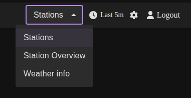
Workspaces let you maintain independent layouts and widget visibility presets. Use the dropdown in the header or press the number keys on your keyboard (1,2,3…) to switch between them.
Click the workspace dropdown to list every workspace saved in your profile.
Choose a workspace to load its layout, widget visibility, and widget configuration. A brief overlay confirms that the workspace is switching. While widgets are still loading, workspace switching controls are temporarily locked to prevent mid-load jumps. Shared workspaces display a
(shared)tag and the owner name in the selector. Depending on the grant, they are either view-only or editable collaborative workspaces.The selection is stored per user, so you will return to the same workspace the next time you log in. Viewers prefer the first shared workspace when one is available.
Workspace snapshots are versioned only when workspace content changes (for example layout, widget visibility/configuration, or panels). Selector-only changes such as switching the active workspace or choosing a time-range preset do not create a new workspace version.
If the workspace you need is missing or you want to reorder/rename the list, open Settings → Workspaces (see below).
Time Range Controls
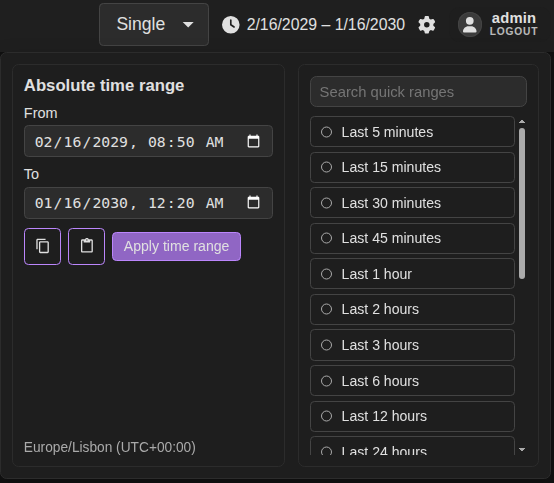
The Time Range picker (🕑 icon in the header) controls the data window for every widget that respects the global time range.
Click the clock icon or the label (for example,
Last 15m) to open the picker.Use the From (UTC) and To (UTC) fields for a precise range. Values are interpreted in UTC; seconds are added automatically.
Select Apply time range to persist the manual values.
Alternatively, use one of the quick buttons (Last 5 minutes, Last 1 hour, …). Choosing a preset instantly updates the dashboards, closes the picker, and saves your choice.
The chosen range is saved to your profile and restored on the next session.
All widgets that have history capabilities can use this selected range.
Settings Portal
Open the Settings portal by clicking the gear icon in the header. The portal appears as a modal overlay with tabs along the top. You can close it with the Close button in the footer, by pressing Esc, or by clicking outside the modal.
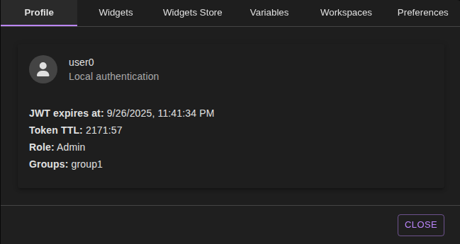
Profile Tab
Use the Profile tab to check authentication details:
Displays your name, username, and avatar (fetched from Microsoft Graph when MSAL is in use).
Shows the backend token time-to-live countdown so you know when to refresh your session.
In local authentication mode, it decodes the stored JWT to show the expiry timestamp, role, and groups.
If no user is logged in, a simple notice appears instead.
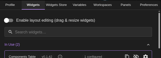
Widgets Tab
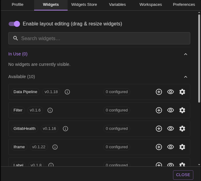
The Widgets tab controls which widgets appear in the current workspace and how they are configured.
Edit toggle: Enable Enable layout editing to allow drag-and-drop and resizing directly on the dashboard. This preference is saved for the current user and workspace; you can also toggle it with the
Ekey while hovering the canvas.Search: Filter widgets by name, key, or version.
In Use vs Available: Widgets in use list all keys that currently have at least one visible instance. Available lists widgets that are configured but hidden, or widgets you can add for the first time.
Quick actions:
Eye icon toggles visibility for all instances of that widget.
Plus icon (for hidden widgets) adds a visible instance using the widget’s default layout.
Duplicate icon creates a new instance based on the most recently used configuration.
Settings icon opens the detailed Widget Configuration Portal.
Widget Context Menu
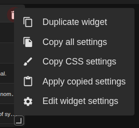
Right-click a widget’s resize handle (the small triangle in the card corner) while layout editing is enabled to open the context menu.
Select Duplicate widget to clone the active instance, preserving its size, panel placement, configuration, and refresh cadence.
Select Edit widget settings to launch the Settings portal with that widget pre-selected in the Widgets tab for deeper adjustments.
The menu is only available when editing is enabled; it hides automatically when the layout is locked.
Widget Configuration Portal
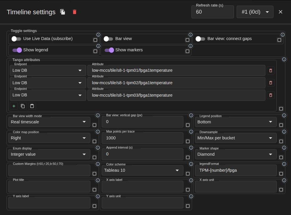
When you click the settings icon for a widget you get a dedicated editor:
Instance picker: If multiple instances exist, switch between them with the dropdown. You can duplicate or delete the selected instance from the header.
Refresh rate: Polling widgets expose a refresh rate field. Enable propagation to copy the new rate to other instances of the same widget.
Configuration fields: Fields reflect the widget definition (numbers, toggles, lists, select menus, etc.) and now render in a denser responsive grid to use space more efficiently on wide screens.
Grouped toggles: Boolean options are grouped together in a compact “Toggle settings” block instead of taking one full row each.
Tango Attributes: Array fields that contain
{ endpoint, attribute }rows now use a dedicated compact editor with:a floating group title rendered on the top-left border (using the schema
titlewhen available, for exampleTango attributes);endpoint and attribute inputs with always-floating labels;
endpoint source fields use schema type
TANGO_DBSwhen a widget supports selecting multiple Tango DB endpoints;list-item attribute type
TANGO_INPUTSenables grouped hover targets per row, each with its own endpoint + attribute controls;no
Default DBoption in the endpoint dropdown; when unset, the first available endpoint is applied automatically;compact row actions (
add,copy,paste,delete) using the same hover-card style help text as the rest of the settings portal;a capped rows area with internal vertical scroll to keep the modal compact even with many attributes.
Propagation toggles: Propagation remains available per setting. Each field (or grouped toggle entry) keeps its own propagate checkbox so you can selectively sync only the options you need across sibling instances.
Close behaviour: Changes commit automatically when you close the portal (as long as there are no validation errors).
Screenshot placeholder: add EndpointAttributePairsField (TANGO_DB rows editor) capture here.
All updates made in this tab are scoped to the active workspace and stored in your profile.
Panels Tab
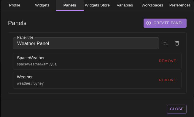
Use the Panels tab to create and maintain the dashboard sections that appear on the canvas.
Create panel: Adds a new empty panel with a generated title. Panels appear immediately on the dashboard; you can rearrange or resize them while layout editing is active.
Rename: Edit the panel title inline. The change is saved when the field loses focus.
Add widget: Click the playlist icon to open a picker of available widgets. Selecting one creates a new instance, assigns it to the panel, and makes it visible.
Remove widget: Each widget listed inside a panel can be removed, which hides it and detaches it from the panel.
Delete panel: When a panel is empty you can remove it entirely. Widgets you remove from panels fall back to the default free canvas.
Panels are saved per workspace. If you clear every panel (or never create one) the dashboard falls back to the classic single canvas that shows all widgets together.
Widgets Store Tab (Administrators)
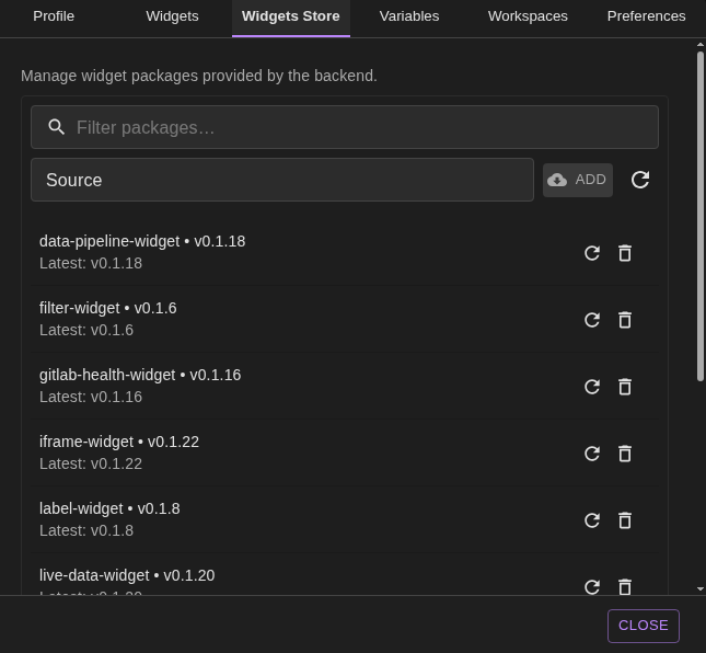
The Widgets Store tab appears only for users whose claims include the Admin role. It manages backend-provided widget packages and affects every user of the deployment, so proceed carefully.
Search bar: Filter packages by label, key, or origin.
Add source: Paste a package source (for example,
npm:@octopus-widgets/foo@1.2.3or a container URI) and click Add to register it. The system fetches the bundle immediately so it is available without a page reload.Check for updates: The refresh icon queries all installed packages for newer versions and reports how many upgrades are available.
Package list: Each entry shows the installed version, the latest known version, and provides buttons to:
Update to the newest version (when available).
Reload bundle to refresh the currently installed build without changing versions.
Remove the package, which opens a confirmation dialog because removal is global.
Variables Tab
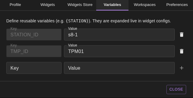
Variables let you define reusable placeholders that widgets can reference (for example {STATION}).
Existing variables appear as key/value pairs. Edit a value to update it everywhere it is used.
Click the trash icon to delete a variable. Widgets referencing it will display the literal placeholder until you define it again.
To add a variable, fill in the Key (stored in uppercase) and Value, then click Add. Keys must be unique.
All changes persist to your user profile and sync across open sessions.
Workspaces Tab
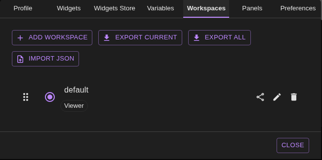
Use this tab to manage the full set of workspaces available in the selector.
Active workspace: The radio button marks which workspace is currently active. Switching updates the dashboard instantly.
Reorder: Drag the handle (::) next to a name to change its order in the dropdown. The new sequence is saved automatically.
Rename: Click the pencil icon, edit the name, then save. Names must be unique and up to 30 characters. Read-only shared workspaces cannot be renamed.
Delete: Click the bin icon to remove a workspace. You cannot delete the last remaining workspace; the app ensures at least one always exists. Shared entries stay in the list until the owner revokes access.
Add workspace: Use the Add workspace button to create a new workspace with default layout and no widgets visible. The new workspace becomes active immediately.
Export:
Export current downloads a JSON file with only the selected workspace.
Export all downloads every workspace you own.
Import JSON: Upload a file exported earlier or a compatible JSON structure. Imported workspaces are normalised and renamed automatically if there are conflicts. You will see a confirmation message summarising how many workspaces were added.
Sharing workspaces
Click the Share icon next to a workspace you own to open the sharing dialog. Choose allowed roles, groups, and/or a comma-separated list of usernames. Leaving every field empty shares the workspace with anyone who can log in.
Choose the access mode:
View only lets recipients open the workspace but blocks layout and widget changes.
Can edit turns the shared workspace into a collaborative workspace; layout and widget changes are written back to the owner workspace instead of creating a private copy.
The dialog populates the dropdowns from
/auth/roles, and the role/group filters are matched against the caller’s JWT claims to prevent forged access.Recipients see shared entries under a dedicated list with the owner name, allowed roles/groups, and access mode. Shared workspaces stay backed by the owner workspace as the single source of truth, and open dashboards refetch automatically when another user saves a change.
Collaborative editors can change layout, panels, visibility, and widget configuration, but they cannot rename, replace, or delete the owner workspace through the shared edit path.
Shared workspace selection is still stored in the recipient profile, but only the changed preference fields are sent to the backend. This reduces payload size and avoids overwriting unrelated settings during a failed save.
To revoke access, remove the share entry for that workspace; recipients keep their own workspaces intact.
Error Notice:

Preferences Tab
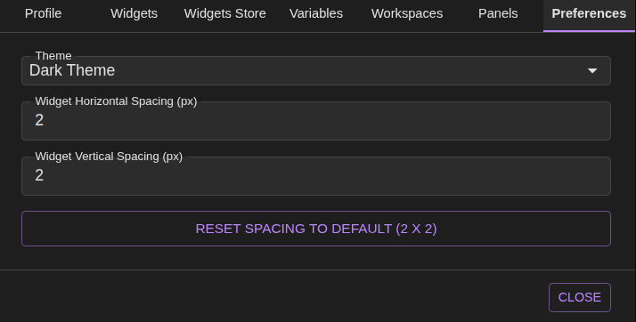
Global preferences customise the look and feel of Octopus.
Theme selector: Choose from the themes provided by the backend. The picker fetches the available list via GraphQL when the tab loads.
Widget spacing: Set the default gutter between widgets (in pixels). Larger values spread widgets out;
0packs them tightly.
Both preferences take effect immediately and are remembered per user.
App Performance Panel
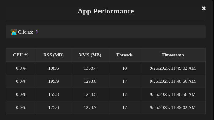
The bottom-right footer tiles show live server metrics supplied over a GraphQL subscription. Click either tile to open the App Performance portal.
Inside the portal you will find:
Clients summary: Total active clients connected to Octopus at the moment of the update.
Worker table: For each backend worker the table lists CPU usage, resident memory (RSS), virtual memory size (VMS), number of threads, and the timestamp when the sample was recorded. Tooltips explain the memory metrics.
Close controls: Click outside the portal or the ✖ button to dismiss it. Metrics continue updating in the footer even when the portal is closed.
Monitoring these metrics helps determine whether slow dashboards are caused by backend load or client-side issues.
Accessibility Checks
We validate widget colours with the WCAG Color Contrast Checker Chrome extension so new layouts stay compliant with WCAG 2.1 AA.
Install and pin the extension in Chrome.
Open the Octopus workspace or widget you want to audit, then launch the checker from the toolbar.
Use the eyedropper on a foreground element (text, icon, chart line) and then on the corresponding background.
Confirm the ratio meets the WCAG AA targets (4.5:1 for body text, 3:1 for large text/icons). Adjust theme variables or widget styles until the checker reports a pass.
Repeat for every state (default, hover, selected) before submitting UI changes.
Documenting the pass/fail output in the pull request description helps reviewers trace which contrasts were verified.