MCCS Calibration Quality Assurance Plots
This package is used to generate calibration solutions for the calibration database. Metrics and plots that probe data quality and observing conditions can help to indicate whether or not a given set of solutions is suitable. Functions to generate summary plots are discussed below. An overview of simple summary metrics is given on the QA metrics page.
The functions discussed on this page are intended to be called alongside
calibrate_mccs_visibility(),
using many of the same input or output data products. These functions return
matplotlib figure identifiers that can be displayed from the script or
notebook, or output as an image file in a standard format.
For example
import matplotlib.pyplot as plt
from ska_low_mccs_calibration.qa import generate_closure_comparison_plots
fig = generate_closure_comparison_plots(
    vis, modelvis, masked_antennas, min_uv=10, ctype="uvmax"
)
fig.savefig("closure_comparison.png")
plt.show
One or more of these functions can be called automatically in
calibrate_mccs_visibility()
using optional dictionary qa_plots. Any plotting functions from
qa() can be listed with a True or False
value, and any set to true will be called with PNG output (named “function.png”
without the generate_ prefix). Use
print(ska_low_mccs_calibration.qa.__all__) for a list. For example:
qa_plots = {
    "generate_gaintable_plots": True,
    "generate_visibility_comparison_plots": False,
    "generate_closure_comparison_plots": True,
}
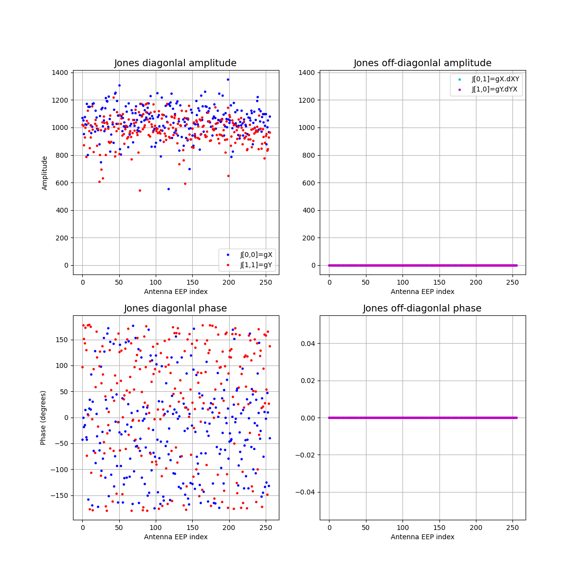
Gaintable plots
Function generate_gaintable_plots()
displays the amplitude and phase of each antenna calibration solution, with
separate panels for diagonal and off-diagonal Jones matrix elements. In the
example below,
calibrate_mccs_visibility() was
called with jones_solve=False, so the off-diagonal terms are all zero.
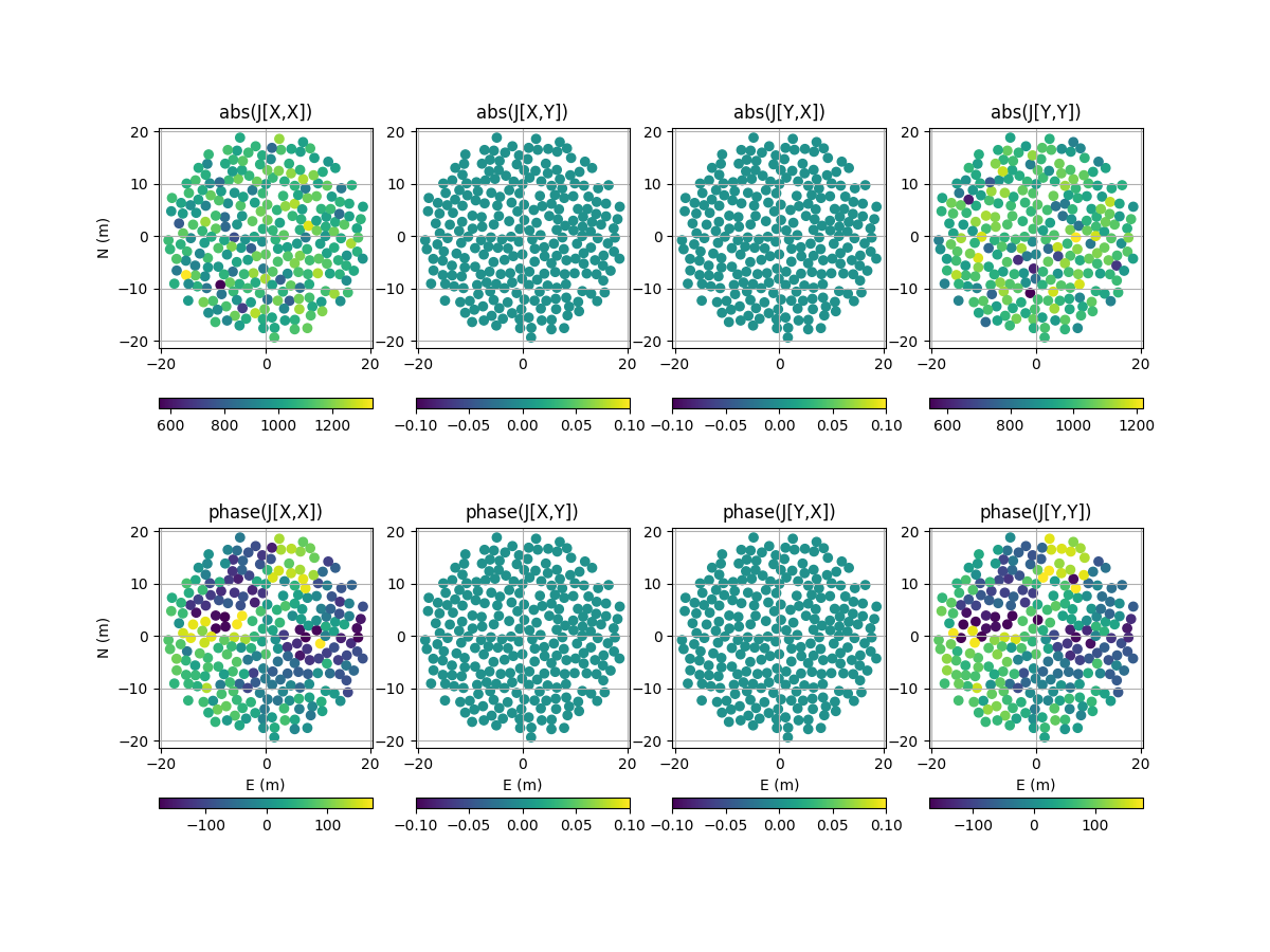
Gaintable scatter plots
Function
generate_gaintable_scatter_plots()
displays the same amplitude and phase data as
generate_gaintable_plots(), as a scatter
plot at the antenna locations.
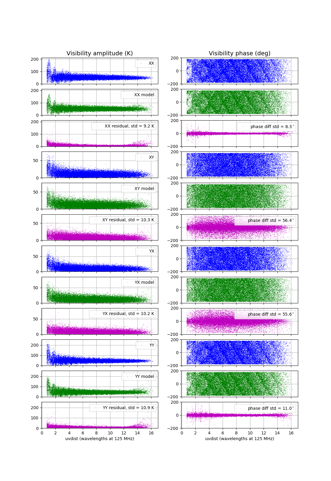
Visibility plots
Function generate_visibility_plots()
displays the amplitude and phase of each visibility sample as a function of
baseline length – in general these will be the calibrated visibilities
returned by
calibrate_mccs_visibility()
– along with model and residual visibilities. A separate set of panels is
shown for each polarisation. In the example below,
calibrate_mccs_visibility() was
called with the GSM and nside=16. This is a low resolution model that
allows the solver to run faster, however model errors can be seen in the plots
for the longer baselines.
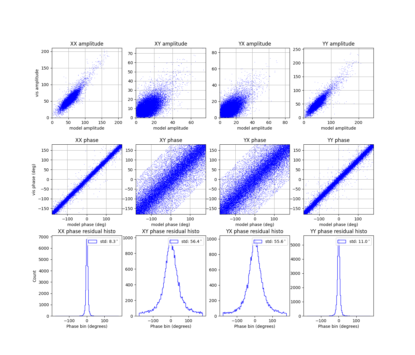
Visibility comparison plots
Function generate_visibility_comparison_plots()
displays the same amplitude and phase data as
generate_visibility_plots(), as a scatter
plot of visibility values versus model visibility values. Also shown are
histograms of the residual phase values.
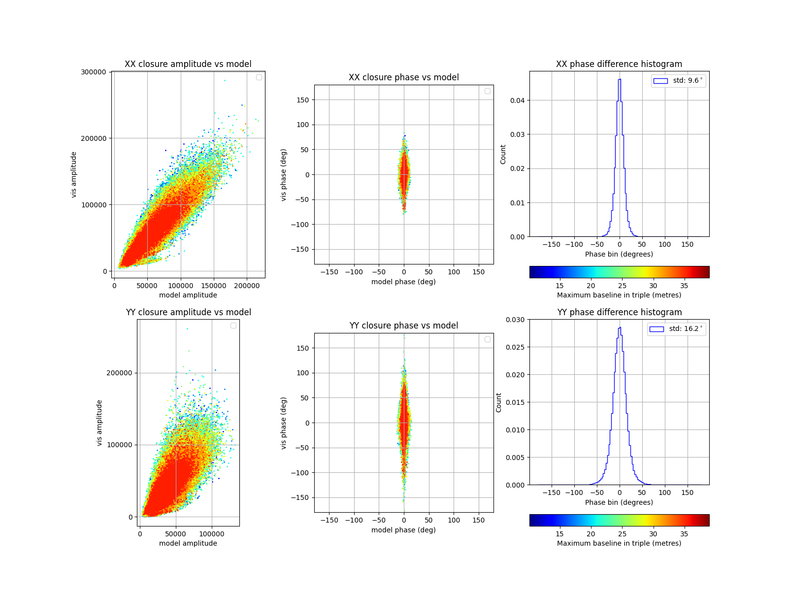
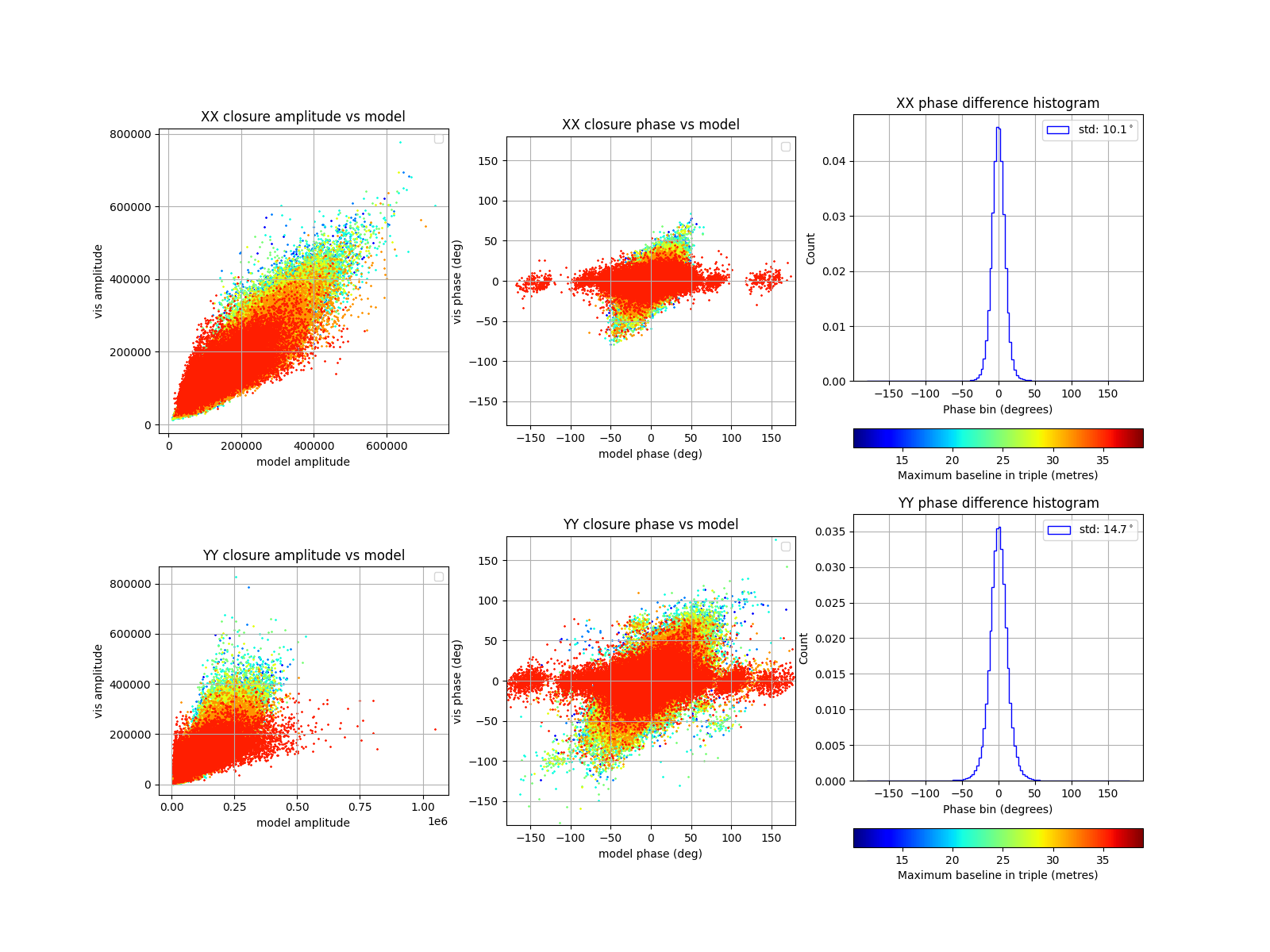
Closure comparison plots
Function generate_closure_comparison_plots()
also displays scatter plots of visibility values versus model values, however
the data plotted are the closure triple products. As in
generate_visibility_comparison_plots(),
histograms of the residual phase values are also shown.
In the example below, the scatter plots have been coloured by the maximum
baseline length in each triplet (running from blue to red), and a short baseline
cutoff of 10 metres has been used. The long-baseline errors that come from
using nside=16 can be seen as a wider model phase spread in red.
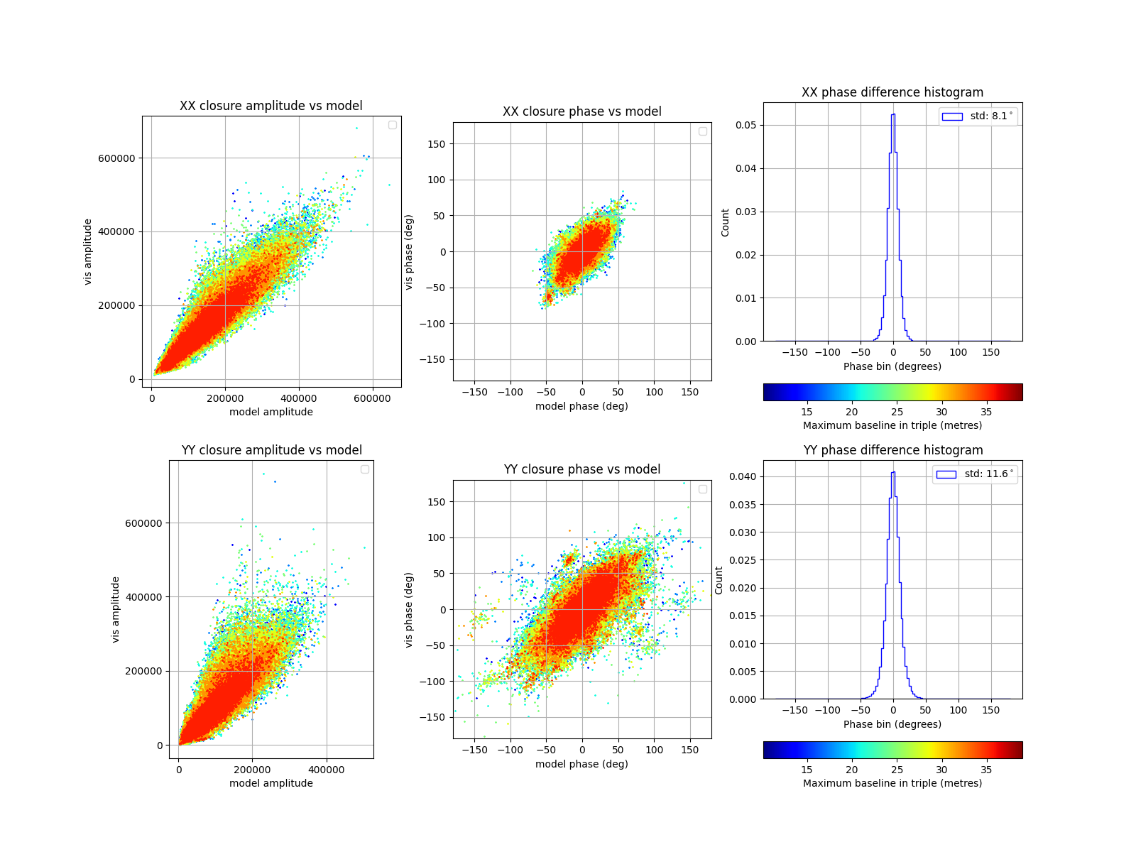
If calibrate_mccs_visibility()
is rerun with nside=32, the phases show better alignment. There is
extra structure in the YY products, which may be due to the higher power
levels seen in the visibility plots above.
On the other hand, if
calibrate_mccs_visibility()
is rerun with skymodel="Sun", the sky is represented by a point source
and the closure phases for the model visibilties are close to zero. The small
offsets from zero are due to the Embedded Element Patterns in the modelled
visibilities.