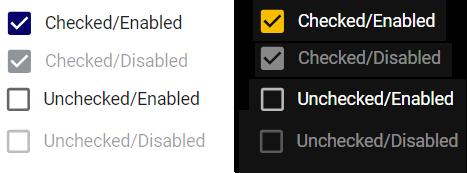
TickBox

Overview

Field for entering text into the application

_images/tickBox.png
import { TickBox } from '@ska-telescope/ska-gui-components';

...

<TickBox label="TickBox testId="testId" />
Properties

Property

Type

Required

default

ariaDescription

string

No

Used by Screen Readers

checked

boolean

No

false

Sets the status of the checkbox

disabled

boolean

No

false

Disables the component if true

fontSize

number

No

28

font size of the text used

label

string

Yes

Label displayed for the Component

labelBold

boolean

No

false

Label is displayed in bold unless disabled

labelPosition

LABEL_POSITION

No

LABEL_POSITION.START

Allows for the positioning of the label

onChange

Function

No

Function executed when the component is clicked

onFocus

Function

No

Function executed when the component is active

testId

string

Yes

Identifier for testing purposes

Constants

header:

“Constant”, “Values”, “Usage”

“LABEL_POSITION”, “Top, Bottom, Start, End”, “Allows for the positioning of the label”

Testing Identifier

Provided by the property testId